Tal Solomon
Head of the UX program@The Academic College of Tel Aviv-Jaffa.
“A project with a lot of investment. The process itself is high quality, short, and efficient. I appreciate the experience and effort, a very successful prototype came out, well done!”
I interned at Firma, a design agency from Tel Aviv with 3 other students as a UX designer as part of my psychology degree, majoring in UX.
As UX interns we were responsible for creating a digital loan procedure for a bank in Israel. While making the procedure, we learned about the company's UX team's methods, processes, and research stages.
The project's primary objective is to collaboratively establish a 'Double Diamond' process in partnership with Firma's UX team, enabling us to immerse ourselves in, learn from, and develop an authentic UX methodology.
We received an MRD that outlined both the stages of the digital loan procedure and the project stages, including:
- Competitors research
- User research
- User Flow
- Screens design
- Presentation of an initial concept
- Final presentation
Part 1•Discovery • Competitors & User Research
Stage one - Competitor research
Our initial step involved seeking out existing knowledge related to digital loans. Our research approach began with exploratory research, starting with competitor analysis, followed by a deep dive into user research. This comprehensive approach allowed us to gain a holistic understanding of the digital loan landscape prior to engaging with platform users.
We received several instructions from the firm team for the competitor research phase:
- Constructing research questions.
- Mapping of direct and indirect competitors.
- Collecting materials and sorting them according to the research questions.
- Extracting insights from the collected information and presenting them.
Our research questions:
- What are the most common platforms for taking a digital loan?
- How many and what are the steps in the digital loan procedure at the various banks?
- Why is the order of the steps in the digital loan flow different in each bank?
- How convenient is it for the user to navigate the entire procedure? (understanding where the user is, going back, undo, finding relevant buttons)
- What is the v & t of the process on the different platforms?
- What and how do the various platforms display on the first screen of the loan procedure?
- What does the bank have to do to get the customer to finish the loan process?
- How do the various platforms present important/incomprehensible information during the loan application procedure?
- What types of loans do the platforms offer?
The competitors:
Banks in Israel are considered our direct competitors, while Israeli non-banking credit companies serve as our indirect competitors.
Insights
We conducted a thorough examination of each research question related to both banks and non-bank credit companies. The culmination of this effort was the creation of a comprehensive competitor research presentation. This presentation encapsulated our findings, outlining the advantages and disadvantages we discovered, providing answers to our research questions, and summarizing the ultimate conclusions drawn from our competitor's research.
Stage two - User research
Following the in-depth competitor research, where we enriched our understanding of digital loans, we transitioned to the user research phase, specifically through user interviews.
In collaboration with Firma's UX team, we invested considerable effort in preparing for these interviews. This included crafting clear, relevant, and well-sequenced questions in advance, identifying suitable interviewees, conducting the interviews themselves, and, crucially, distilling the valuable insights that surfaced during these interviews.
Our research primarily followed a qualitative approach, focusing on gaining insights into the processes and behaviors of our target audience—individuals who obtained loans, whether digitally or through traditional banking channels. This approach was 'qualitative' in nature since it involved interviews with these individuals and did not entail direct observation of their actions in practice.
Here is a link to the questions we developed to delve into user behavior, motivations for obtaining loans, pain points, challenges, and coping strategies.
Due to time constraints, we were only able to conduct interviews with a total of four individuals, which was a limitation of our research.
Part 2•Define•Findings & Conclusions
We created a comprehensive presentation that summarized and shared the findings, conclusions and valuable insights gathered from both our competitor research and user interviews.
We extracted several critical insights from our competitor's research, which we integrated into our own procedure:
- Certainty and Security for Users: To instill confidence and prevent confusion, we incorporated features such as an initial screen explaining the procedure, clear progress indicators, step summaries, and user-friendly navigation.
- Streamlined Process: Acknowledging the significance of time efficiency, we've carefully crafted our digital loan procedure to find the perfect equilibrium between brevity and thoroughness, steering clear of both overly concise and excessively protracted processes.
- Trust-building: We emphasized the importance of supporting users throughout the process with informative content, including clear explanations within the interface, well-designed dropdowns, and detailed micro-copy. These elements help users feel in control, fully understood, and comfortable throughout the process.
We consider all these elements integral to creating a convenient, user-friendly, and valuable experience.
The key takeaways from our user research that influenced our procedure are as follows:
- Emergency Situations: Users often seek loans for urgent needs, such as addressing deficits, settling debts, or making various essential purchases.
- Instant Digital Loans: Users are drawn to instant digital loans primarily due to the convenience, speed, and ease they offer.
- Calculative Approach: Interviewees revealed a tendency to be calculated and plan loans well in advance.
- Preference for Banks: Users expressed a preference for obtaining loans from their own banks over alternative platforms.
According to the interviewees, the ideal digital loan application process should:
- Be concise and avoid excessive verbosity while instilling a sense of certainty.
- Provide straightforward and brief explanations for any unclear concepts.
- Offer support from the bank and a feeling of security throughout the process.
- Allow users the flexibility to choose their loan repayment schedule.
- Be simple, user-friendly, fast, and transparent."
Our persona :
Stage three - User Flow
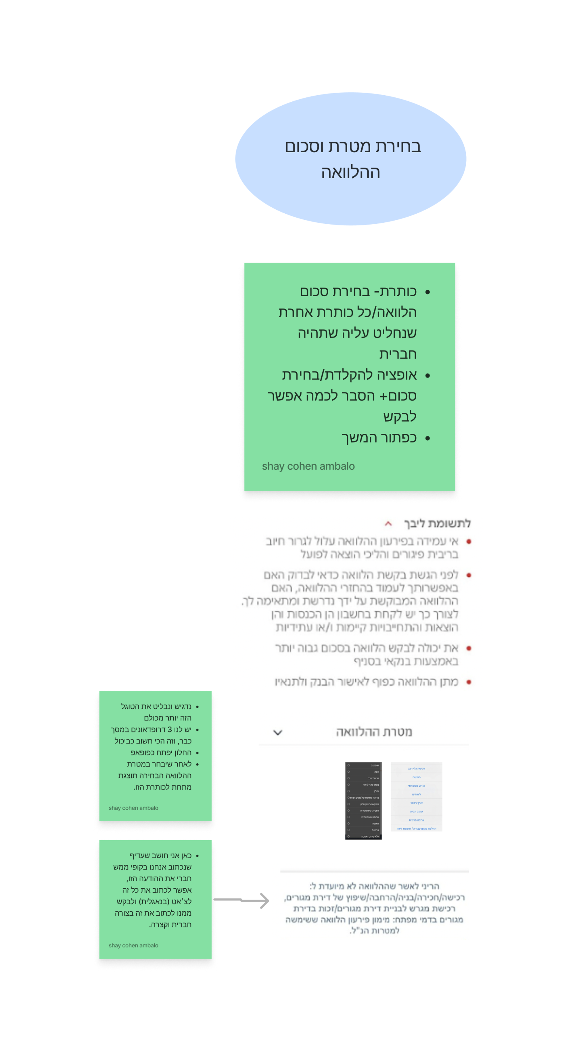
We created the User Flow together with explanations for the flow stages. under each element, we added a note whose purpose is to explain the Flow - its location and the rationale behind it (decisions based on the research we have done).
The UX team at Firma really liked the idea of the notes that were under each screen,, We were told it was a great way to present the User Flow:
Part 3•Design & Deliver•Solution
Stages Fourth and Fifth -screens design and presentation of an initial concept
As we neared the project's conclusion, we received a directive to craft high-fidelity screens encompassing the entire journey we meticulously designed.
To tackle this task efficiently, we divided our team into two groups:
- One group took charge of crafting the content and copy to be presented on the screens.
- The other group focused on the actual screen design within Figma.
To facilitate the planning and execution of screen creation, we segmented each decision, choice, and screen from our User Flow individually. Below each, we detailed the specific elements and content that would be featured at that particular stage or screen, ensuring a seamless and comprehensive user experience.
Below these elements, we incorporated competitor screen examples (with photos) for inspiration and as a reference to apply the insights from our competitor and user research. for example:
Creating the initial screens & improving the screens
To illustrate the evolution of our screens, we initially presented the initial versions. During this presentation, we received feedback and clarifications from the firm's team, enabling us to enhance them for the final presentation.
To showcase these improvements effectively, we chose to present them in a table format. This table offers a side-by-side comparison of the two screen sets, highlighting the advantages and disadvantages of each:
Comparison Order:
- Screens are displayed on the right side of the table, following the flow from the first screen to the last.
- Advantages and disadvantages are listed on the left side of the table, with elements arranged in descending order from top to bottom.
- We first show the screen from the original presentation, followed by the improved version.
For example:
- In our collaboration with the Firma team, usability tests were not a specified requirement, and consequently, we did not conduct any.
Screens:
The prototype
Challenges Encountered:
1. Terminology: Initially, the unfamiliar terminology and financial concepts in the world of loans posed a hurdle, making it challenging to immerse ourselves in this domain.
2. Competitor Research: While conducting competitor research on various platforms, we couldn't complete the process by actually taking a 'real' loan. As a result, we lacked insight into the final stages of obtaining a digital loan from different competitors.
3. User Research: User research in the context of loans presented its own set of difficulties. The topic was sensitive and personal, leading some participants to withhold certain details during interviews. This hesitancy may have prevented us from fully understanding their genuine pain points. Additionally, conducting remote interviews via Zoom posed a potential obstacle to building trust on such a personal and sensitive subject.
Step Six - Final Presentation Here you can view the final presentation
Thanks to my team, I had a great time with you: Tamar Cahani, Romi Golebowicz, and Noam Boksenboim.